Context
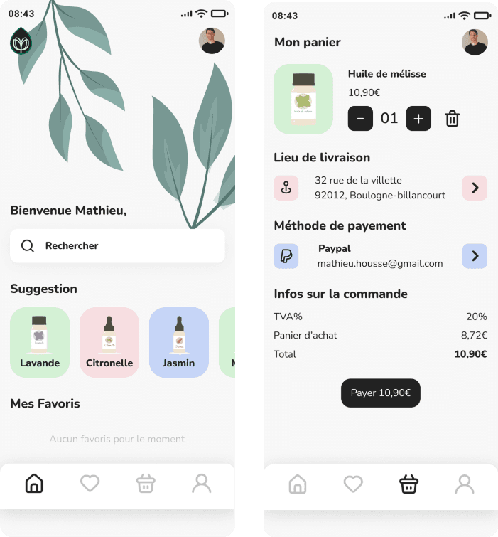
As part of a school project, we designed an app that helps users choose the right essential oil for their needs, even without any knowledge of aromatherapy.
Project objective
This project had a primarily UI-focused objective:
To design a comprehensive and consistent design system for a simple app centered around essential oils.
We chose this theme because it allows us to explore a soothing and natural visual language:
Organic colors, inspired by nature
Soft, legible typefaces
Botanical iconography
Educational and reassuring UI elements
The app thus served as a platform for creating and documenting the Design System.
Concept & How it works
The app allows users to:
Select a need (stress, sleep, digestion, etc.)
Receive a recommendation for a suitable essential oil
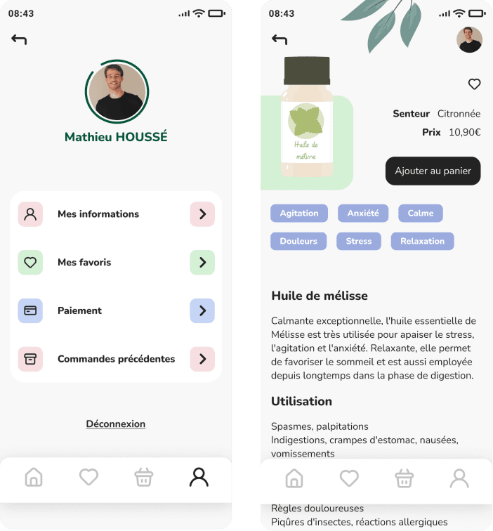
View the product page to learn more
Design system
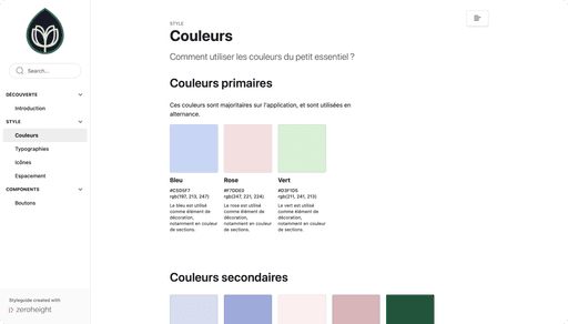
We designed a visual system based on:
A natural color palette (greens, beiges, soft tones) to evoke the plant world
Modern, easy-to-read typefaces
Illustrated icons inspired by leaves and plants
Reusable modular components (buttons, cards, icons)
Consistent grids and spacing to ensure harmony
Category:
Mobile / Design system / Oil essential
Project duration :
1 week
Team :
Saïdou BEAVOGUI — Opale DORION
Localisation :
Paris